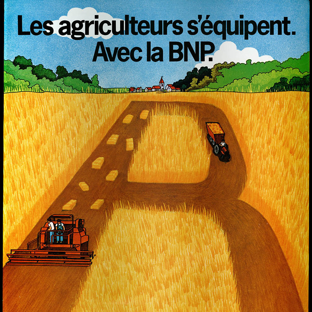
BNP associates its image with technology
In 1987 BNP modified its visual identity at the instigation of a new structure, the communication and publicity department, created in 1984. It unveiled the new creation at the Roland Garros international tennis tournament that it had been associated with since 1973.
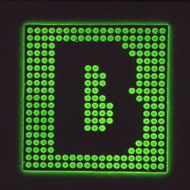
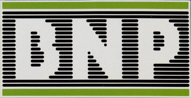
The logo highlighted both the international side and technological side of the bank. First of all, it was a return to the “BNP” acronym, abandoned in 1973 for the “B”, and horizontal lines replaced the disks of the previous visual. They conjure up BNP’s dynamism, speed, performance and technology. The colours chosen are inspired by the computer: the green of computer screens and the light grey of office automation hardware cases. The logo also recalls the logo of IBM, the famous computer firm.


Did you enjoy this story ?
This selection of articles might also interest you!