The bank architecture of the 60s-70’s, between pop culture and high-tech – SLIDESHOW

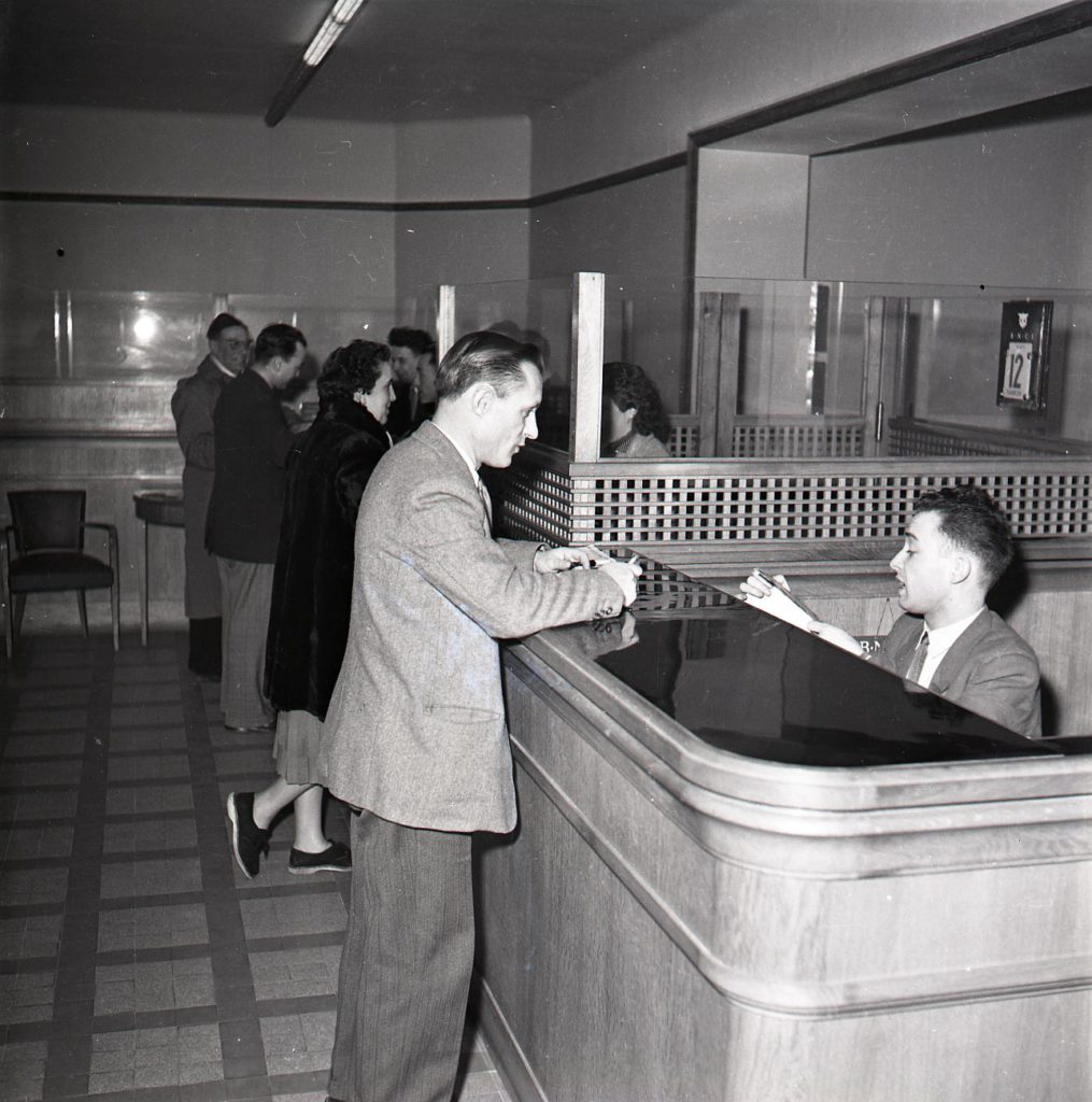
Constantly changing, bank architecture reflects the changes in society and conveys the Bank’s image. From an originally severe bank architecture that highlighted security, after the Second World War the bank branches transformed into an open space.
In 1945, in tune with the tastes of the day, bank agencies were sober, comprised of traditional materials and protected by grated wickets. But in the middle of the 1960s, a new client relationship, “sit-down bank“, brought about a more transparent and luminous architecture. This period marked an abrupt change in the history of bank design and architecture, putting an end to austere and traditional finishes.
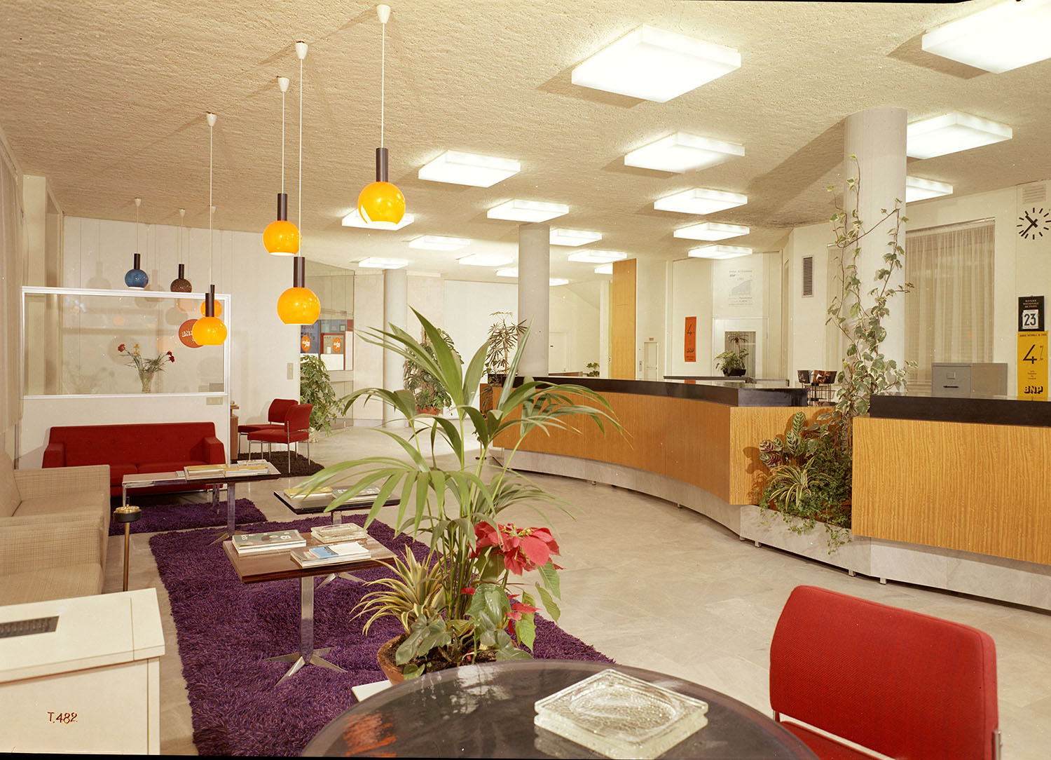
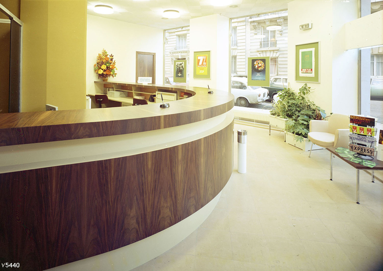
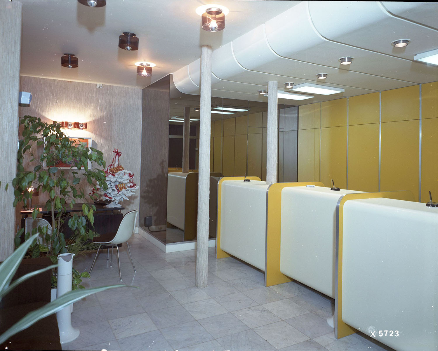
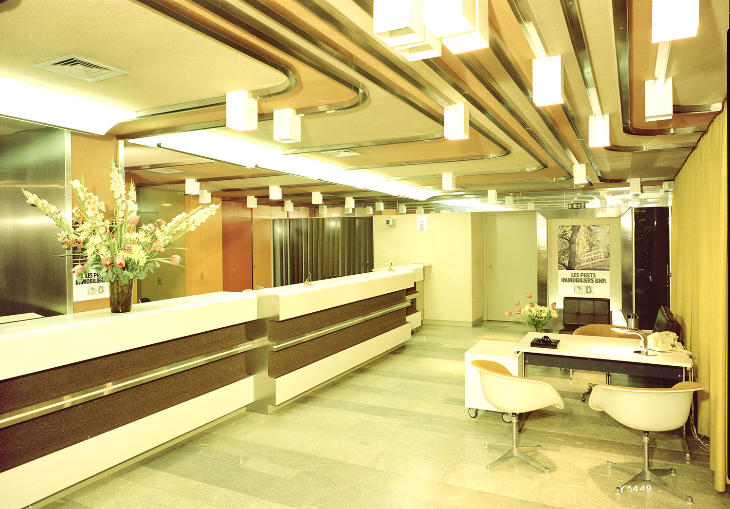
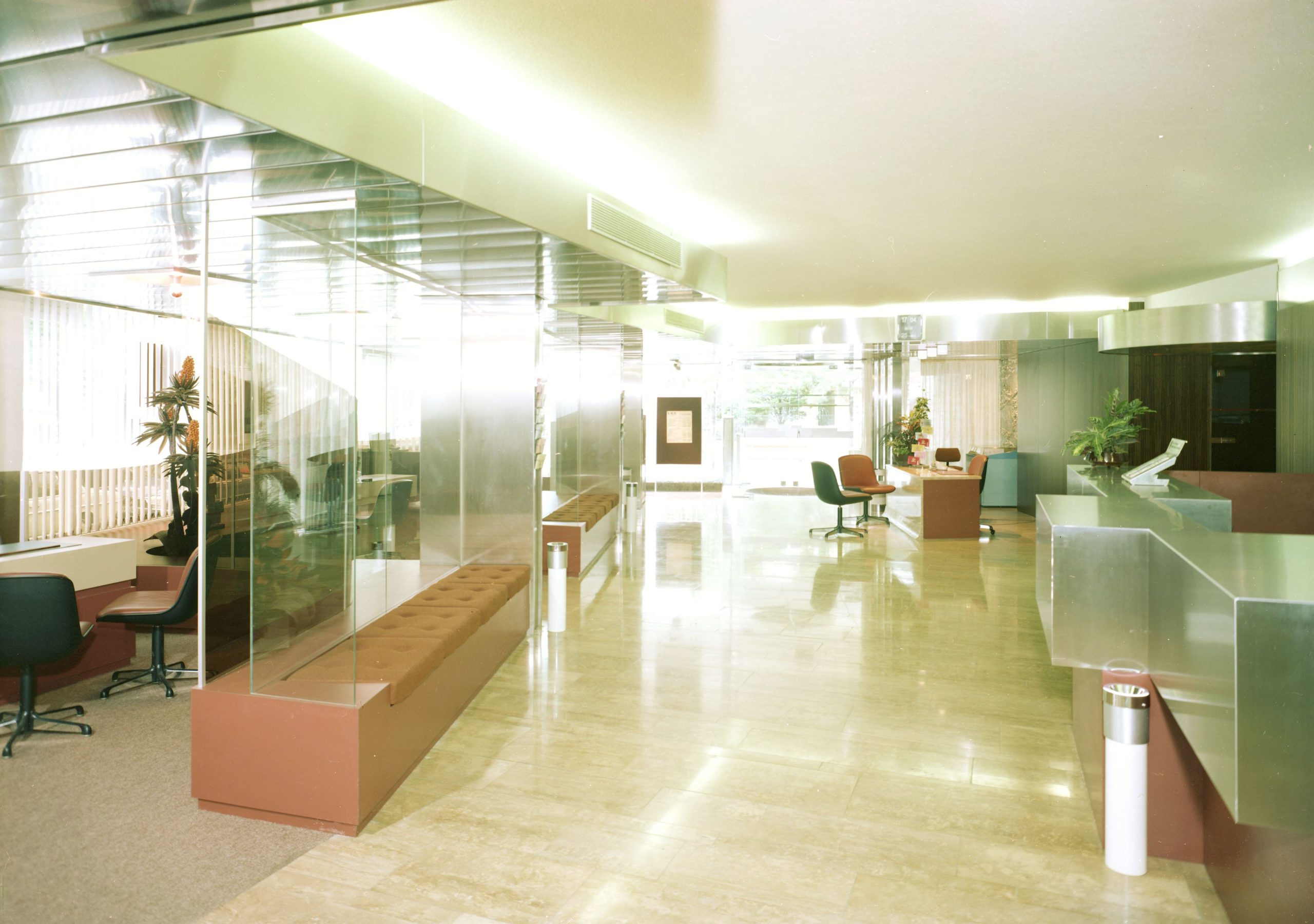
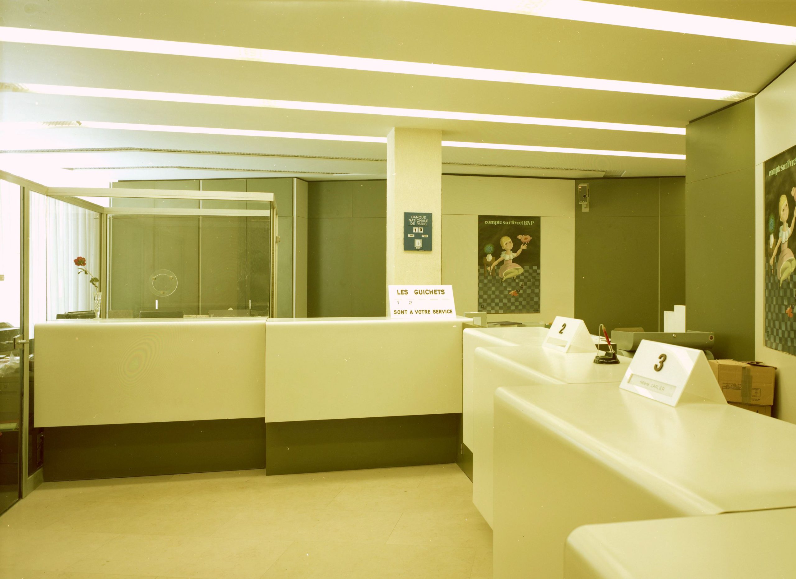
Glass panels replaced the grated wickets, while lively colours, printed patterns and curves made their way inside, as shown in the photograph archives of the Chevojon studio, which worked a lot for the banks. The photos of the BNP branches between 1967 and 1977 are precious witnesses to a bank architecture that has virtually disappeared today due to changes in practices. In them we see large reception areas where spacious counters were still widely used and where there were comparatively fewer closed areas. The Pop design aesthetics were characterised by the orange, red, yellow or green furniture, the concentric patterns and the omnipresence of carpets. There were also many floor-standing ashtrays, symbols of a lifestyle.
VIEW THE SLIDESHOW
Concerned about its heritage and the impression made on clients, BNP called on famous architects for its head office, its offices and its branches, like André Bruyère (1912-1998), known for excluding any orthogonality. “The whole is a sculpture serving daily constraints” (André Bruyère)
The Banque Nationale pour le Commerce et l’Industrie (BNCI), BNP’s forerunner, placed its first order with him in 1960 to remodel a branch in the 13th district of Paris. This was the start of a more than 30-year collaboration that saw more than 80 branches remodelled. From his highly diverse creations, a common point emerges that André Bruyère insisted on, which is the notion of welcome. “Everything I do is conceived to convey courteousness”, he said, especially by installing curved benches.
The architect wanted to go beyond the simple welcome required by the bank’s very function, offering a relaxing area where the client would feel at ease like on a café terrace. The counters, much larger then because networked data processing had not been developed, were in a curved line. This choice made it possible to create sub-spaces and to personalise each one. For some of his creations, he called on other professionals like the sculptor, Alain le Breton or the ceramist, Véronique Monod.
Most of his creations have disappeared today due to changes in locations, the format of agencies and practices. One of the rare branches to have survived over the years bears witness to this Pop Art period under the influence of this architect at 1 place Clichy in Paris.

Today, BNP Paribas has its own in-house architectural firm. Based on a unified charter, the layout and decoration of its agencies have been adapted to the everyday use of digital technologies and clients’ new habits. The format and the layout vary based on the purpose of the retail outlet.


