The Evolution of the BNP Logo
May 1966. The merger between BNCI (Banque Nationale pour le Commerce et l’Industrie) and CNEP (Comptoir National d’Escompte de Paris) is finalized—but the real challenge is just beginning. With only two months left before the official launch of Banque Nationale de Paris, the race is on: transforming hundreds of branches, replacing signage, printing millions of documents… and, above all, designing the BNP logo—a symbol that would embody the bank’s identity for decades to come. The story of a rapid birth… and the evolution of an icon.
May to July 1966: Two Months to Build a Legacy
On May 4, 1966, the French public learns of a landmark decision during the evening news. At 5:30 PM, an official statement is released: Banque Nationale de Paris (BNP) will be formally established on July 1, 1966. The new bank is created to fulfill the public authorities’ objective of consolidating France’s banking sector.
With only two months until launch, an intense effort begins: the bank must define its name, shape its identity, and establish its credibility—all within a tight deadline.
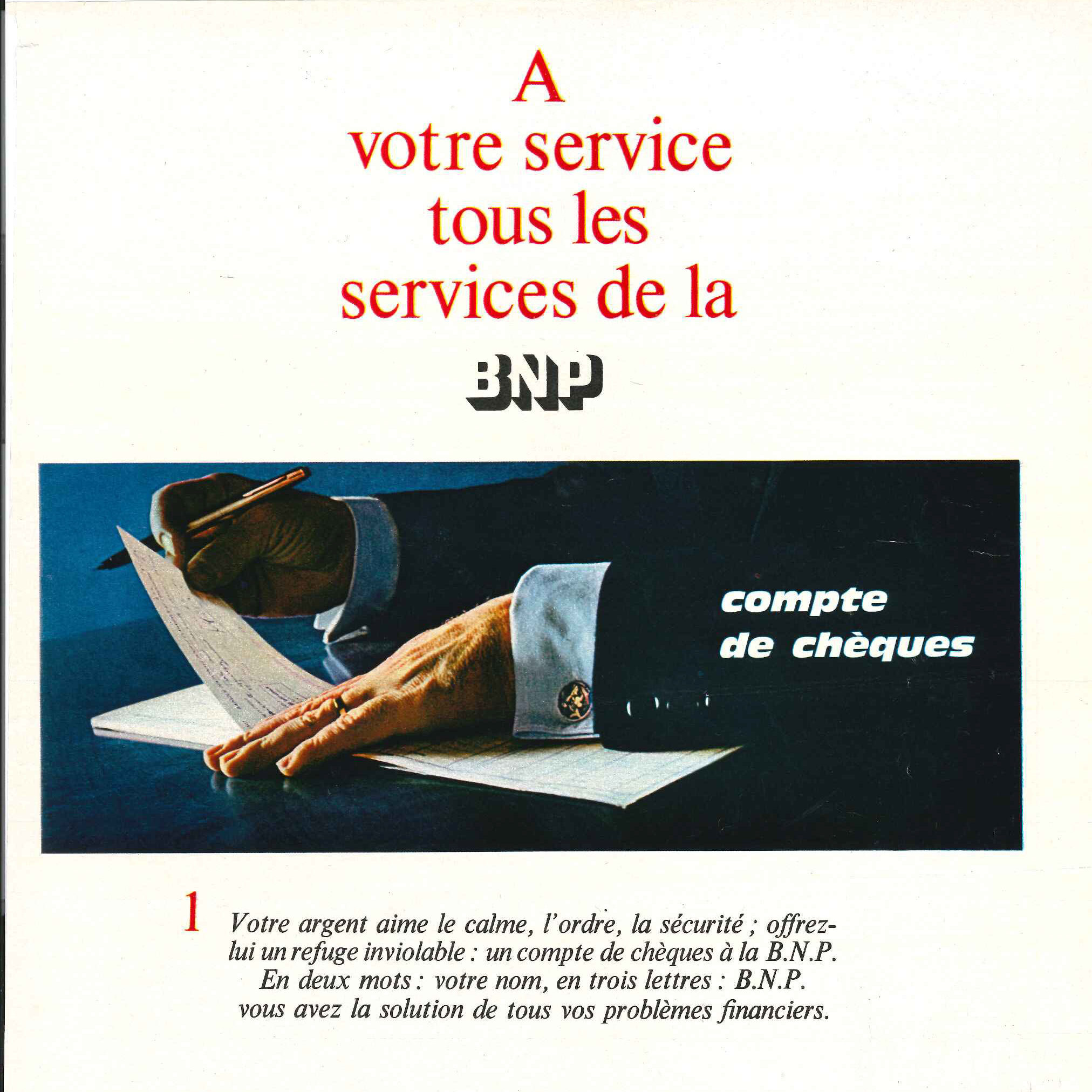
What Does the BNP Acronym Stand For?
The new bank’s name—displayed in bold, raised letters—reflects its forward-looking mission:
- Banque: A modern, universal bank, moving beyond outdated terms like “Comptoir”.
- Nationale: A nationalized institution, building on its predecessors’ legacy.
- Paris: A symbol of prestige, tied to the capital’s global influence.
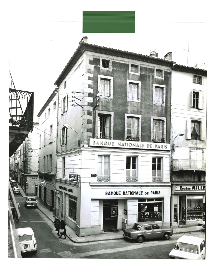
In Practice: The Challenge of Transformation in Branches
The merger of the two banks now takes physical form—and time is running out. Every branch must undergo a complete overhaul: no detail is too small, and every day counts.
By July 1, new signage adorns the façades, while inside and out, posters in Banque Nationale de Paris colors replace the old ones. Even checks and customer documents must bear the new identity. From this date forward, no checkbook may leave a branch without the new bank’s mark.
All instructions are issued the week of June 27: branches in Paris and across France have just days to implement these changes. Everything must be ready by July 1.
A Public Awareness Campaign to Reach the General Public
Beyond serving its customers, the new institution must also establish itself in the public eye—etching its name into the minds of the French people. The brand-new acronym becomes ubiquitous in daily life. Bold capital letters appear on train station walls, catching the eye of hurried commuters, and extend to street corners across the country. The message is clear everywhere: a new bank has arrived, and its era has begun.
1973: A New Logo Emerges
Seven years after its founding, BNP has firmly established its reputation. The Bank now seeks to embody a new vision of modernity.
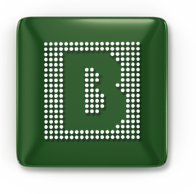
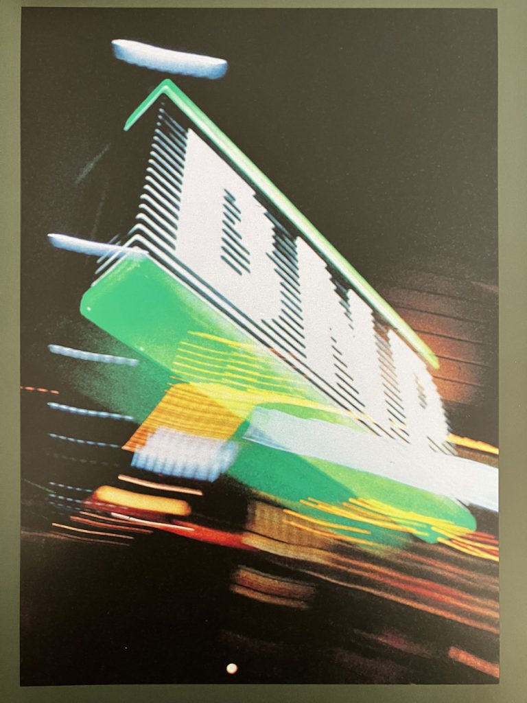
Thus, the “B” logo is born—a bold, graphic design featuring a 19×19 grid, a subtle nod to precision, order, and the emerging digital era of screens and pixels. The double “B” serves as both the initial for BNP and Banque, a unique distinction since none of France’s three historic major banks included the word “Banque” in their names at the time.
The new “B” logo breaks free from rigid design constraints. It appears as a watermark on official documents, a decorative pattern on posters, or in outlined or high-contrast forms. This creative flexibility mirrors the spirit of the times—a bank embracing innovation.
1987: Achieving Clear Recognition
A decade after its debut, the “B” logo—designed to embody BNP’s modernity—confronts a more complex reality. While its 19×19 grid, once groundbreaking, left a lasting impression, it has not always conveyed its message with clarity. Worse still: public confusion persists.
How Is the BNP Brand Perceived?
In this street interview, passersby attempt to guess which brand lies behind the “B” logo.
(BNP-produced film, 1987)
The conclusion is clear: “From city streets to every corner of France, our 20 kilometers of BNP storefronts and signage must leave no doubt. Wherever our brand appears, it should be instantly recognizable—no confusion, no hesitation.”
A fundamental requirement: clear, unambiguous recognition.
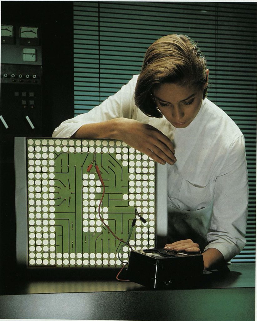
The New BNP Logo: Built on a Strong Visual Identity Framework
To reflect its personality as a technology-driven bank, BNP seeks a fresh visual identity and partners with a design agency for this transformation.
The goal: retain the well-recognized BNP acronym while drawing inspiration from the existing “B” logo.
The agency develops two graphic design proposals, testing them with both customers and non-customers. After this phase, the final choice is made based on public feedback.
The result: a consistent graphic standard applied across all materials—façades, internal signage, and checkbooks—with a defined color palette of green and gray
Branded items to embody the brand
-
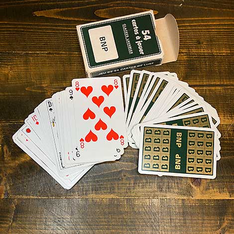
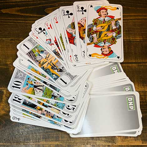
Playing Cards
A 54-card deck featuring the ‘B’ logo and the BNP acronym. BNP Paribas Historical Archives
/
Playing Cards
A 54-card deck featuring the ‘B’ logo and the BNP acronym. BNP Paribas Historical Archives
/ -
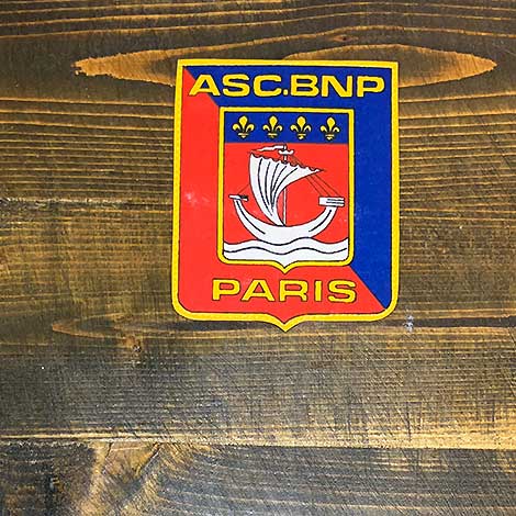
BNP Paris ASC Embroidered Patch
A sew-on shield-shaped badge for BNP’s Paris Sports and Cultural Association (ASC). BNP Paribas Historical Archives
/
BNP Paris ASC Embroidered Patch
A sew-on shield-shaped badge for BNP’s Paris Sports and Cultural Association (ASC). BNP Paribas Historical Archives
/ -
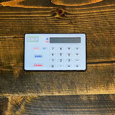
Francs-to-Euros Converter
A calculator designed to simplify the conversion from French Francs to Euros, 2000. BNP Paribas Historical Archives
/
Francs-to-Euros Converter
A calculator designed to simplify the conversion from French Francs to Euros, 2000. BNP Paribas Historical Archives
/ -
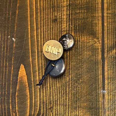
Buttons
Uniform buttons from BNP Paribas. BNP Paribas Historical Archives
/
Buttons
Uniform buttons from BNP Paribas. BNP Paribas Historical Archives
/ -
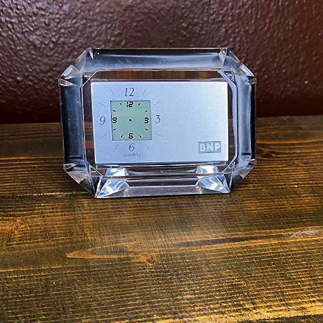
Desk clock
BNP Paribas Historical Archives
/
Desk clock
BNP Paribas Historical Archives
/ -
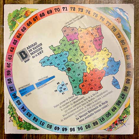
French Department Finder
Rotating cardboard disc for identifying French departments by their number. BNP Paribas Historical Archives, OBA196
/
French Department Finder
Rotating cardboard disc for identifying French departments by their number. BNP Paribas Historical Archives, OBA196
/ -
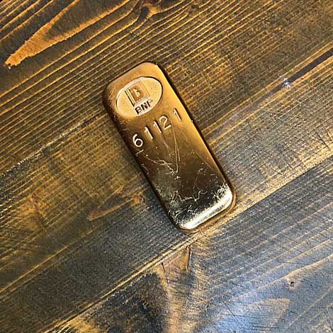
Gold bar
BNP gold ingot, 1980s. BNP Paribas Historical Archives
/
Gold bar
BNP gold ingot, 1980s. BNP Paribas Historical Archives
/ -
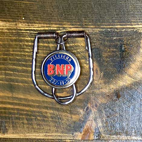
Suspender Clips
1960s–1970s suspender fasteners. BNP Paribas Historical Archives
/
Suspender Clips
1960s–1970s suspender fasteners. BNP Paribas Historical Archives
/ -
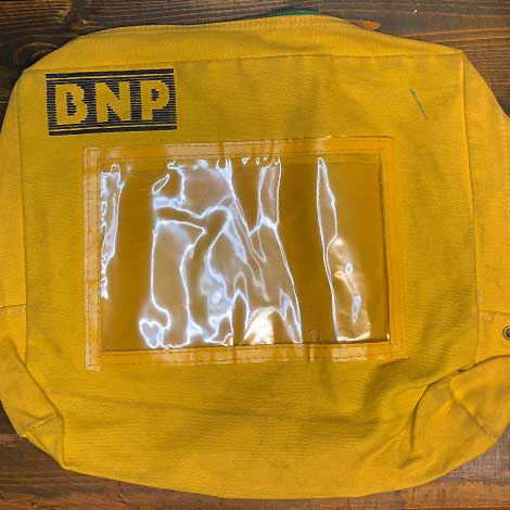
Mail satchel
Mail satchel used for distributing correspondence within BNP branches and departments. BNP Paribas Historical Archives
/
Mail satchel
Mail satchel used for distributing correspondence within BNP branches and departments. BNP Paribas Historical Archives
/ -
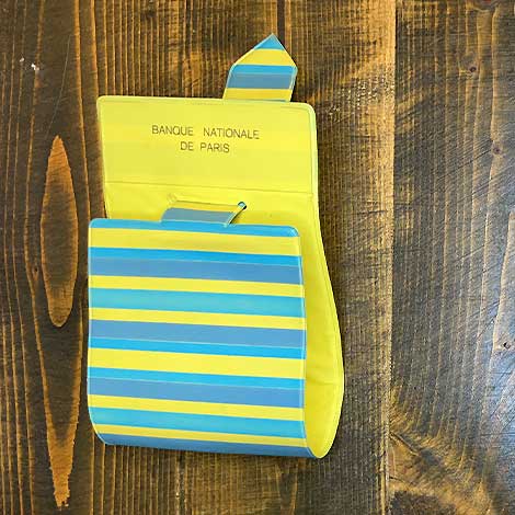
Wallet
Three-fold plastic wallet. BNP Paribas Historical Archives
/
Wallet
Three-fold plastic wallet. BNP Paribas Historical Archives
/ -
Keychain
Keychain lock featuring embossed icons of sports sponsored by BNP in the 1980s–1990s. BNP Paribas Historical Archives
/
Keychain
Keychain lock featuring embossed icons of sports sponsored by BNP in the 1980s–1990s. BNP Paribas Historical Archives
/ -
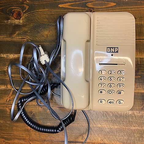
Wired telephone
Office telephone used in BNP branches during the 1980s–1990s. BNP Paribas Historical Archives
/
Wired telephone
Office telephone used in BNP branches during the 1980s–1990s. BNP Paribas Historical Archives
/ -
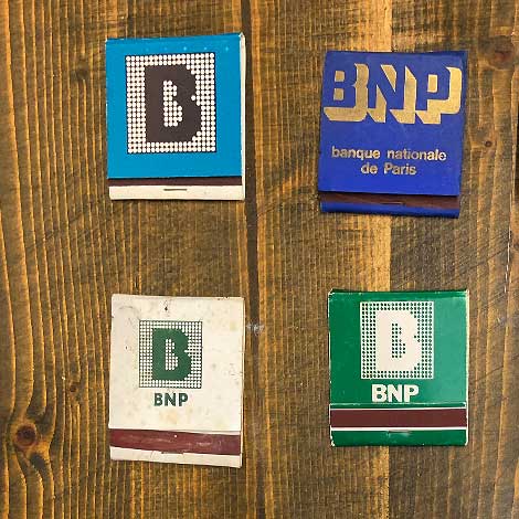
Matchbook
BNP branded matchboxes showcasing the evolution of the bank’s logo. BNP Paribas Historical Archives
/
Matchbook
BNP branded matchboxes showcasing the evolution of the bank’s logo. BNP Paribas Historical Archives
/ -
Tarot Deck
BNP tarot card set, 78 cards. BNP Paribas Historical Archives
/
Tarot Deck
BNP tarot card set, 78 cards. BNP Paribas Historical Archives
/ -
Adhesive notepad packet
BNP adhesive notepad packet. BNP Paribas Historical Archives
/
Adhesive notepad packet
BNP adhesive notepad packet. BNP Paribas Historical Archives
/
To go further:


Did you enjoy this story ?
This selection of articles might also interest you!