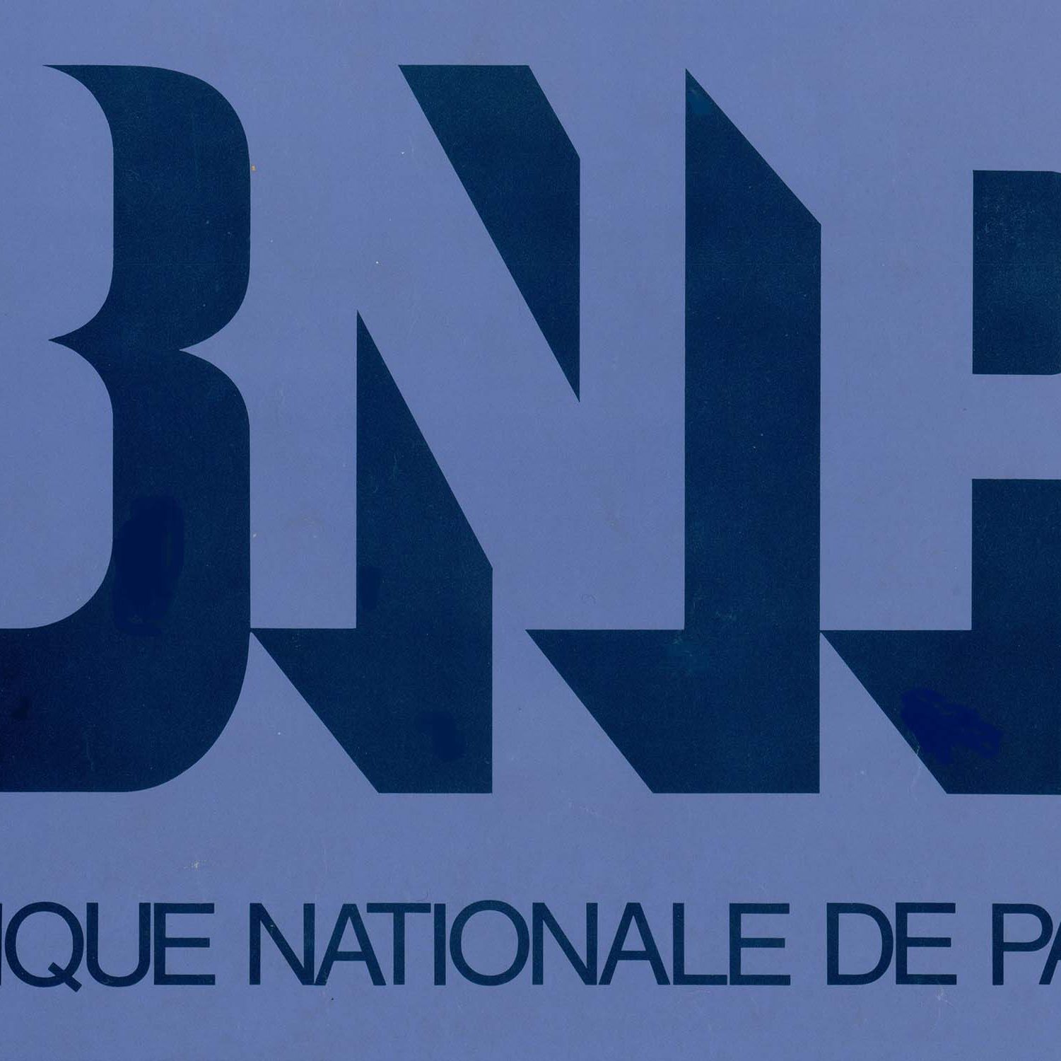
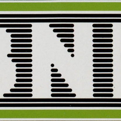
The “B” logo: a reference to BNP and to the bank
Seven years after its creation, the BNP wanted to give itself a new image, that of a bank that accepts the nature of its business: money transactions carried out skilfully in the interests of customers and the bank. The new “B” logo created in 1973 is in line with this goal. It is comprised of a grid of 19 x 19 dots that reveal the letter B. It is the B of BNP but also the B of Bank because, at this time, BNP is the only one of the three historical French institutions whose name includes the word bank. This graphic recalling computer screens suggests an innovative and technological bank. The use of the “B” logo is once again not governed by any graphics charter. Indeed, there are two ways to show the “B”: either the dots composing the letter are of a different colour than the grid or the part corresponding to the letter is blacked out. Furthermore, no place is attributed to the B on the bank’s documents and its use varies depending on the departments and the authors of the materials. Thus it is often used as a decoration.


